PayPal • Business App Platform
Business app platform

Overview
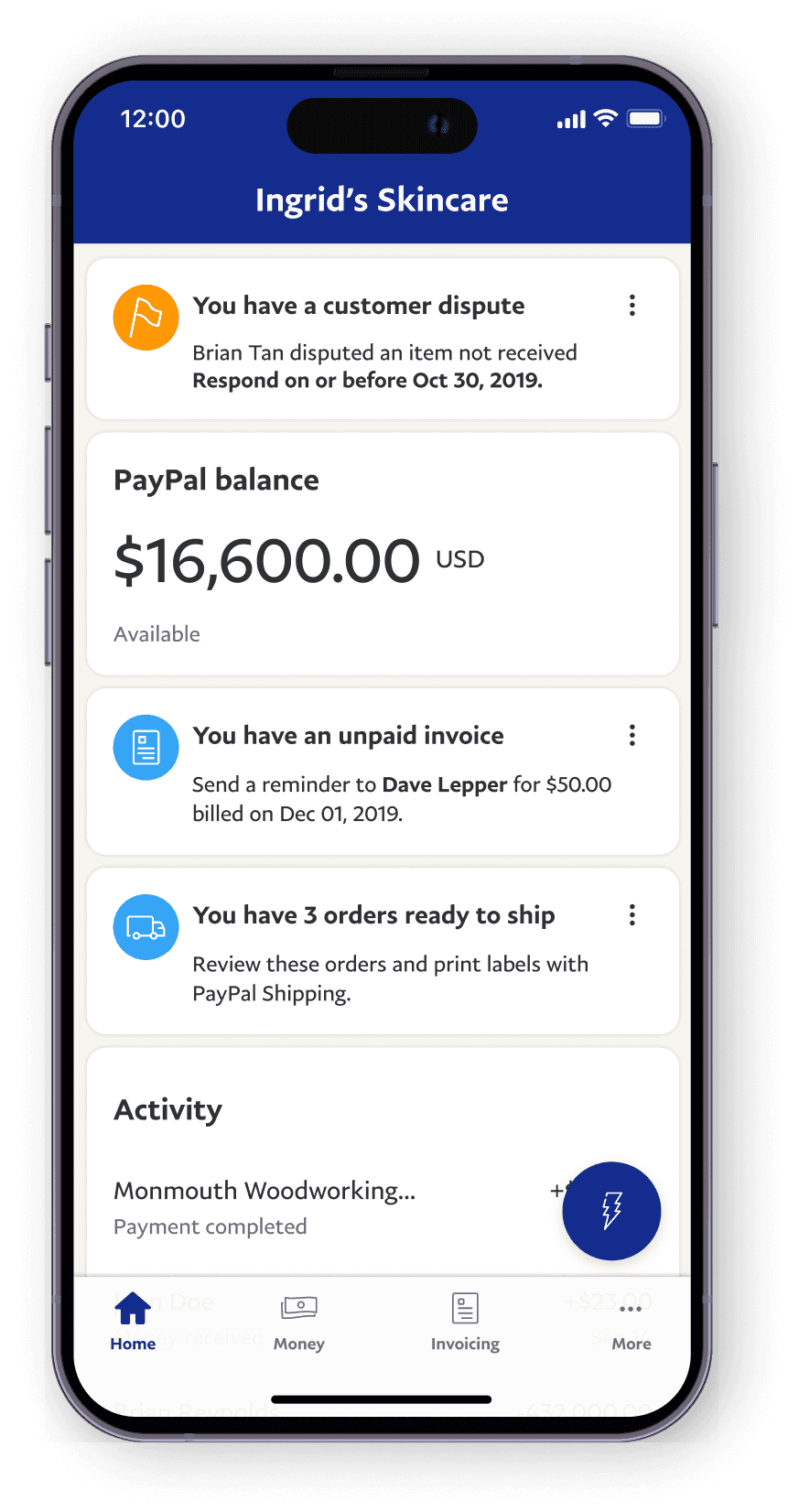
I created a design framework to scale PayPal Business, a native app that empowers 1.2 million small business owners worldwide enabling them to manage their sales operations by sending invoices, monitoring progress, resolving disputes, tracking loans, and reviewing transactions.
My role
As an IC design lead, I shaped the vision and framework of the Business App, positioning it as a convenient payment solution for on-the-go small businesses.
I also mentored a junior designer, ensuring adherence to best practices, collaborated with project managers, a researcher, and mobile engineers on iOS and Android platforms.
This retrospective provides glimpses of my three-year journey with the team and covers highlights of this journey.
Impact
I helped my team turn the app into a platform that other teams could participate into, and get mobile and web parity. The benefit for small business was that they were able to manage their business on mobile, in the same way they did on the web experience.
100% year over year growth
Every year we doubled our user base, and maintained a 4.3 star rating on both Android and iOS app stores.
Removed feature siloes
The home framework design took information out of the silos of features and pages, adding transparency to the app.
Helped extend the mobile design system
The card patterns were adopted by other teams and added to the PayPal design system.
Challenge: Tasks were hard to find and complete
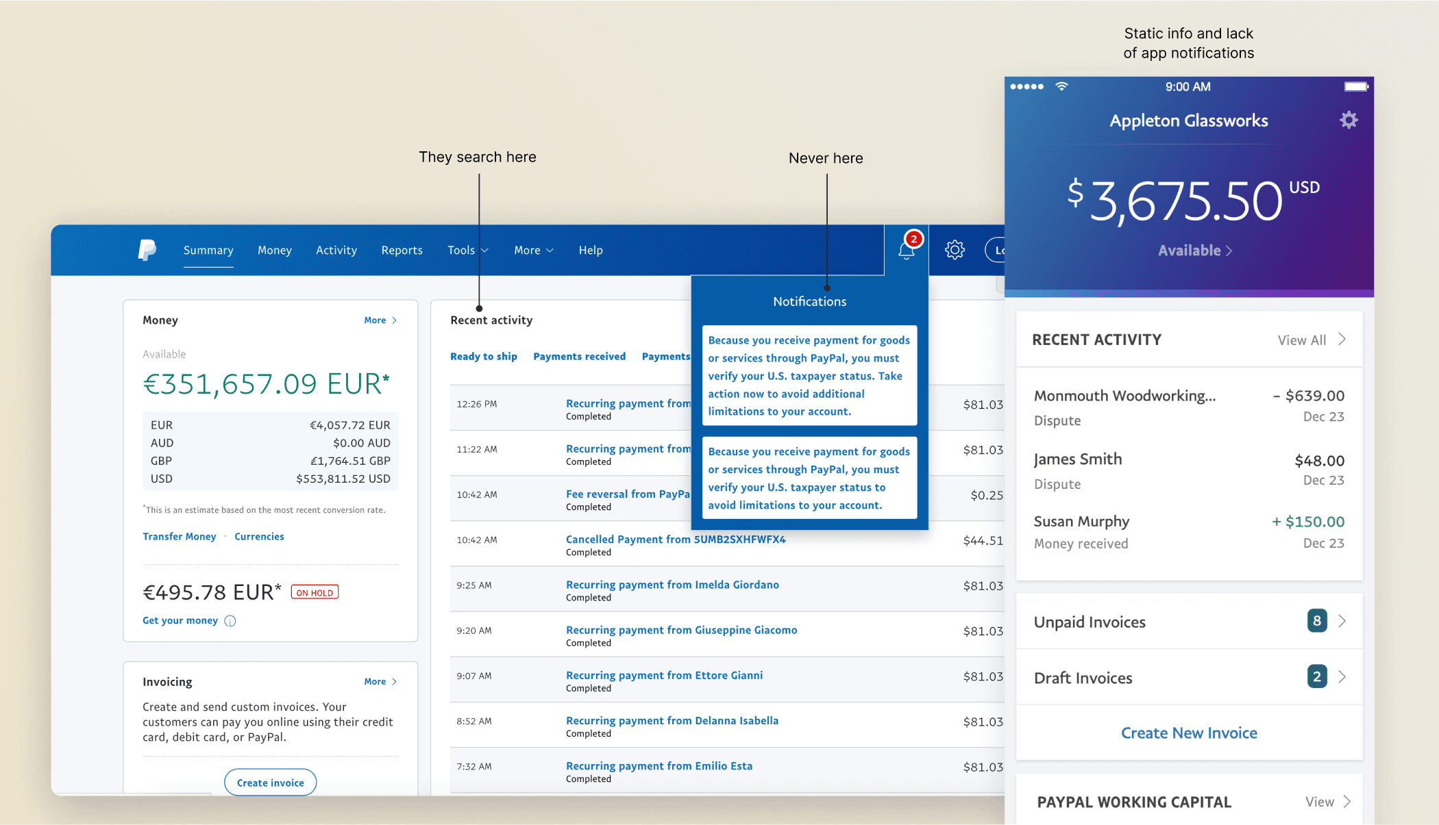
Merchants struggled to complete everyday tasks on PayPal — things like responding to disputes, creating invoices, or checking orders that need shipping. On the app, they could mostly just view info, not take action. On web, key details were scattered across transaction lists and notifications, making it tough to get anything done quickly.
The rise of competitors emphasizing streamlined payment experiences necessitated a critical evaluation of our own checkout flow. Our existing architecture, housing over 30 features, had become dense. A significant portion of the interface was occupied by less critical information, inadvertently obscuring valuable features like PayPal Credit and new flexible payment options. This complexity hindered feature discovery and adoption.
Our challenge was to strategically simplify the information architecture, prioritizing key payment methods and integrating new capabilities intuitively for a broad user base, without disrupting established user behaviors tied to our high conversion rate.
Static and scattered experiences on mobile and web


Diary study & card sorting results
Our goal was to evolve the product from just viewing payments to something more useful on the go, giving merchants real tools to manage their business in the field, not just at a desk.
To shape our direction, I partnered with our research team on a diary study and a card sorting exercise. We spent time with small business owners in the U.S. and India, observing how they work, what tools they use and asking what matters to them
Mismatched expectations
Merchants downloaded the app expecting it to mirror the web, but found it lacked key info and actions.
Quick, on-the-go use & tasks tracked elsewhere.
Averaging 2.5 minutes per session, merchants often used the app between errands or customer interactions, and needed flow speed. Because PayPal did not offer a clean way to track tasks, merchants resorted to physical notes and lists.
Doers and checkers
We saw two main behaviors:
Doers: Send invoices and payment reminders
Checkers: Constantly monitor transactions and cash flow
Refund blind spots
Power users were frustrated they couldn’t see or act on refund requests in the app. Since PayPal auto-refunds after 5 days with no response, they often found out too late — losing both money and trust.
Need to know, nice to know, everything else
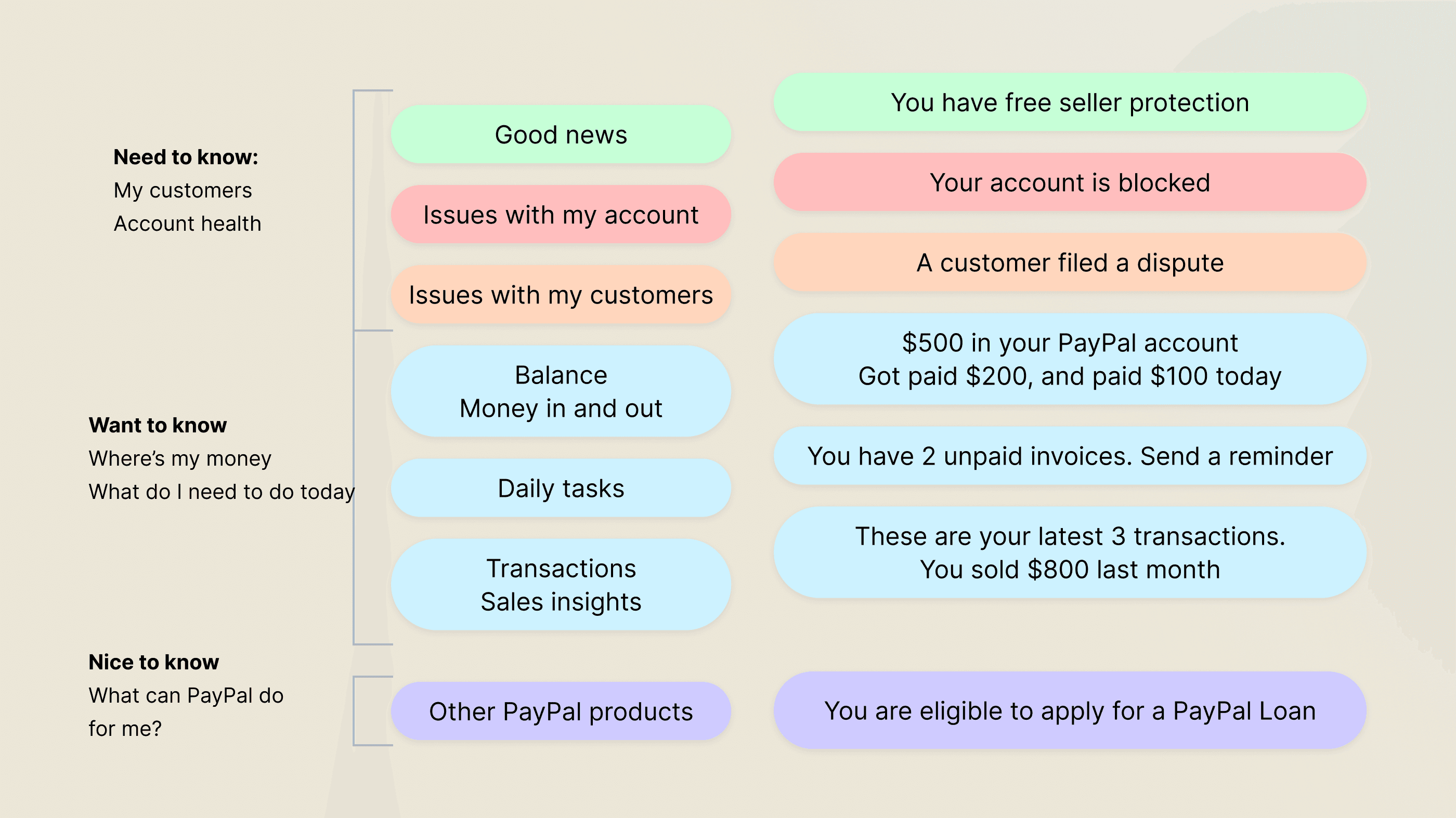
Card sorting showed us merchants care most about anything that impacts their customers or delays getting paid. Next came transactional details like “Who paid me?”, and way down the list were new offers or products from us.
Merchant hierarchy of needs


Mission and goals
Our mission was to build a personalized, at-a-glance dashboard showing each user’s overall status and what actions they needed to take next. At the same time, we aimed to make the app a platform that other teams could easily plug into — all while achieving feature parity with the web.
MISSION
Give small business owners a view of their cash flow and surface relevant insights and important tasks so they can stay organized and get paid.
Testing goals
Successful task completion during testing
Launch metrics
Increase 30-day retention rate from 21 to 28%
Internal goals
Create design frameworks to help teams contribute to the app.
Mobile and web collaboration
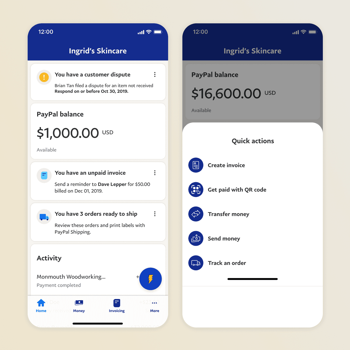
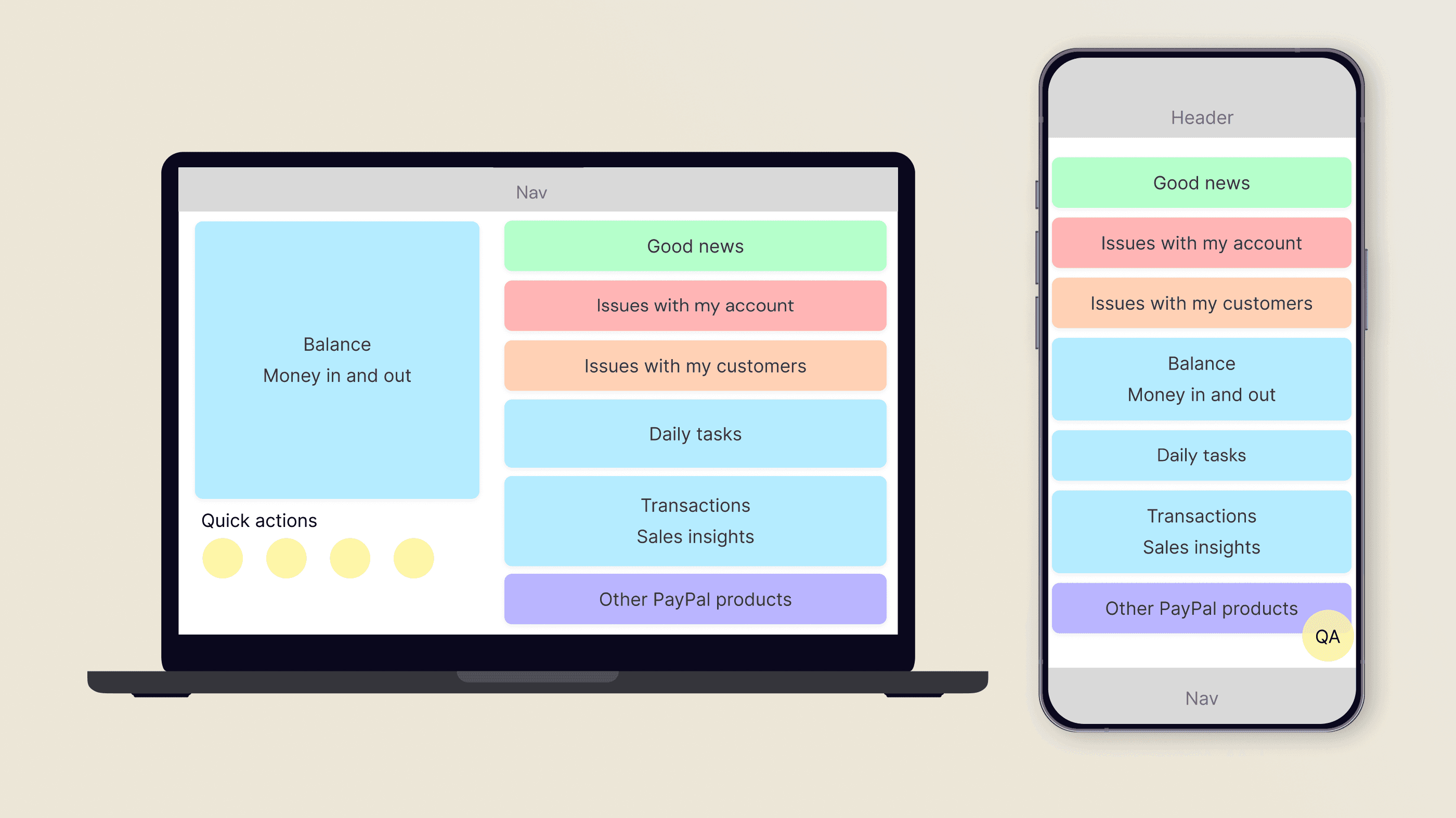
In collaboration with the web home screen team, I developed a scalable Home Framework that consistently presented information across platforms. I prioritized discrete areas for critical information, ensuring a sense of permanence and providing guidelines for other teams to add notifications, features, and cross-sells.
Blueprint for mobile and web experiences


Design directions
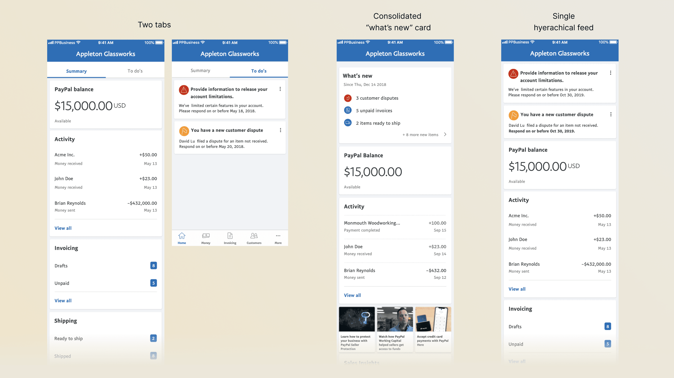
I explored multiple design directions, trying to balance work that the home web team had created before us, like the idea of keeping notifications in a secondary tab, which I sensed mobile users wouldn't visit given their usual speed of use , but had the curiosity to test.
The idea of a consolidated card with notifications was discarded early on, as it required our notifications system to be fully rebuilt.
Design directions


User feedback
We tested two designs: a tabbed layout and a single-feed hierarchy. The tabbed design buried notifications, making them hard to find and rarely used. In contrast, users preferred the single feed for its better visibility and easier action-taking. Our web team found the same results.
Single feed concept
Tabbed concept
Final alignment
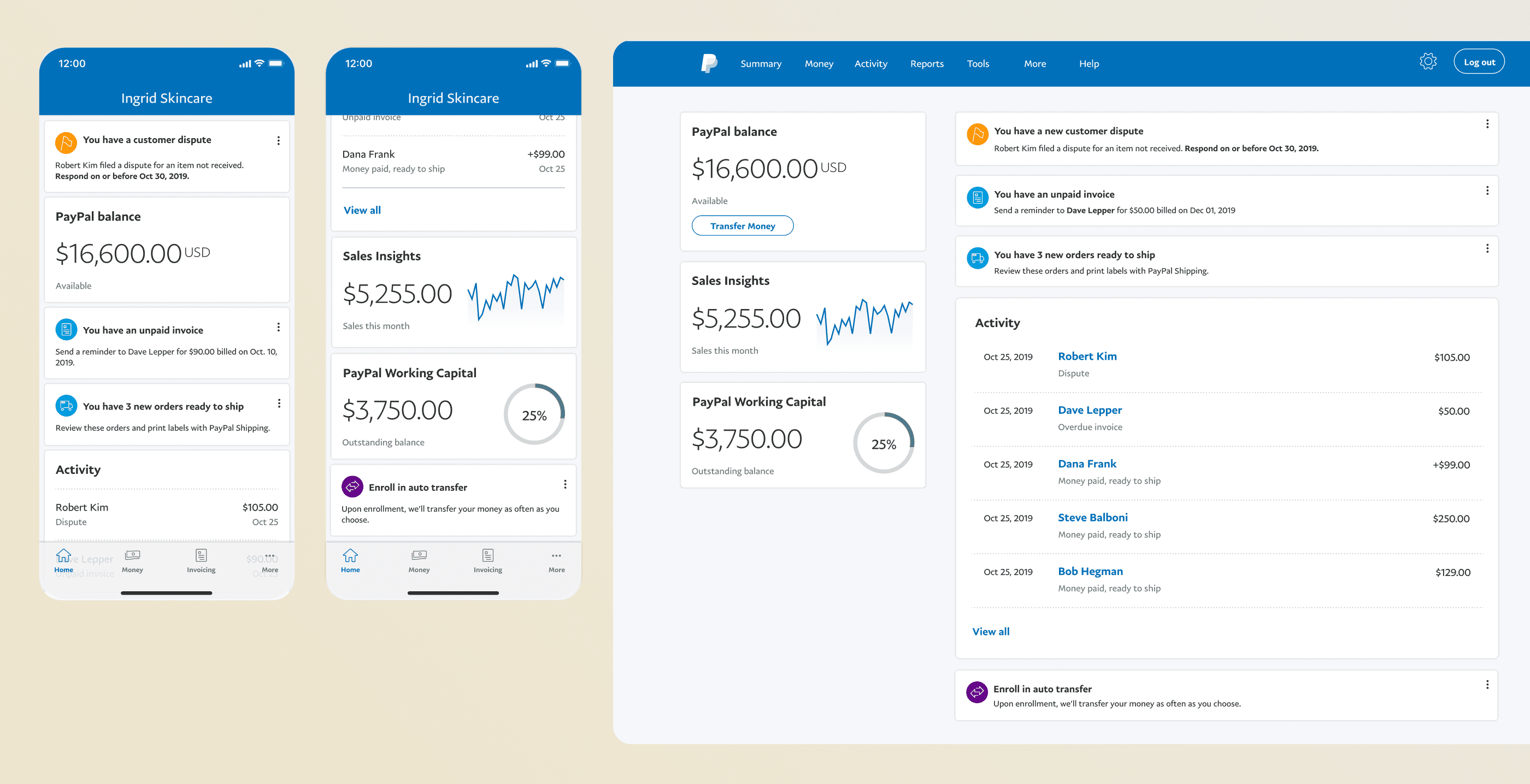
Our usability tests helped both the web and mobile teams converge on a single design. Over 2 months we worked together to create a hierarchy that served the needs of mobile and web users on each experience, while balancing pattern parity. I contributed with card designs for our messaging system, and influenced the web team to use concise content and a clean list design.
Final concept for mobile and web


Working in phases across the org
After wrapping up the concept phase, we moved into phase two: closing the gaps between mobile and web, and adding missing features and messaging on mobile. I collaborated with designers across the merchant org to understand their use cases, help translate them into our new design framework, and integrate their flows into the app. Here are some examples of in-app messaging across different communication types.
Messaging rolled out across teams
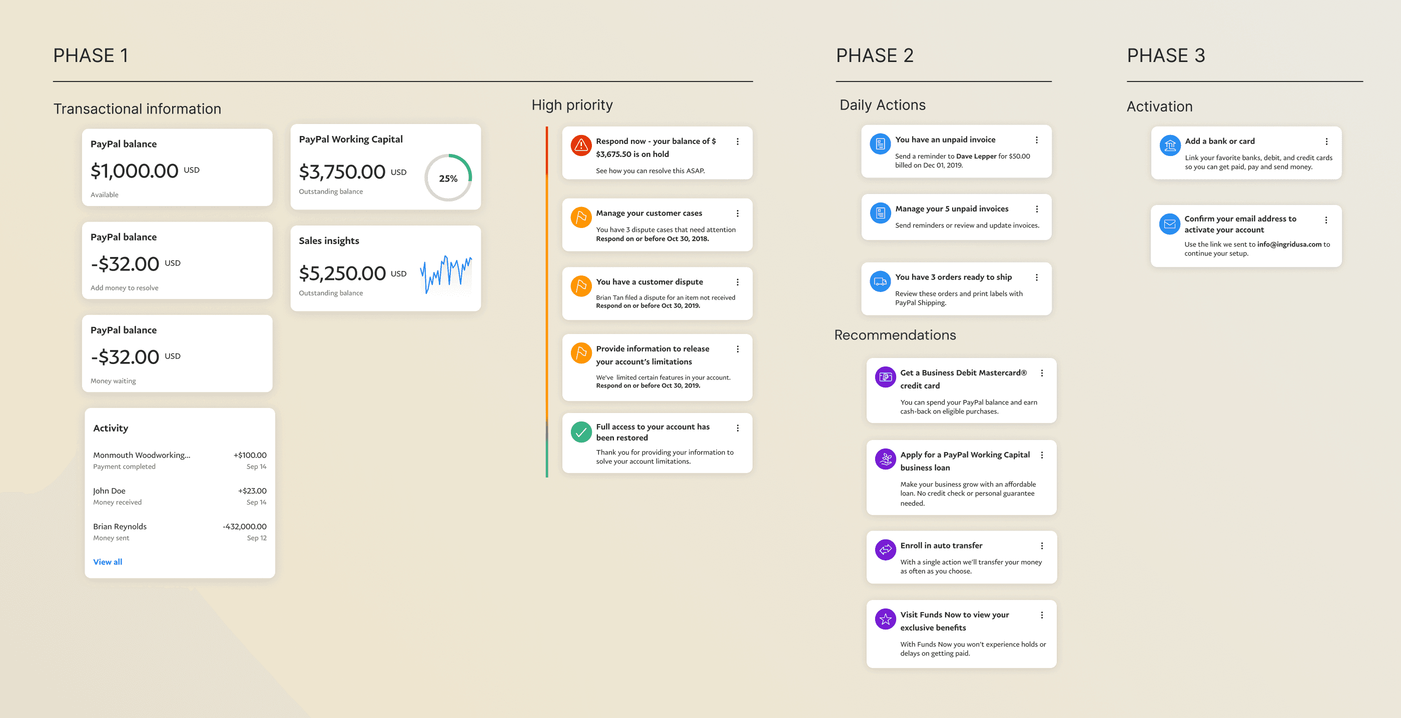


Documentation shared with teams
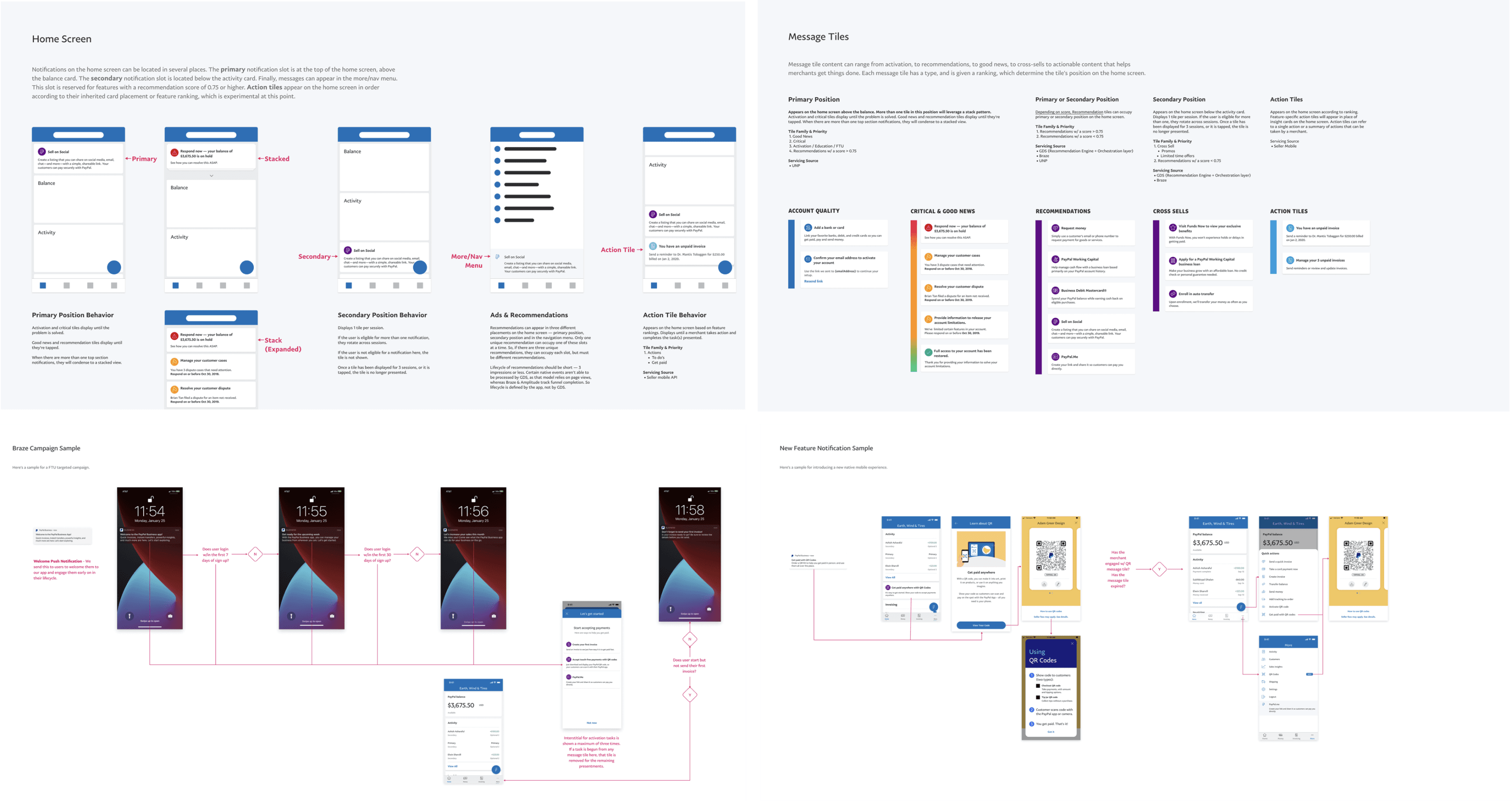


Card-ranking
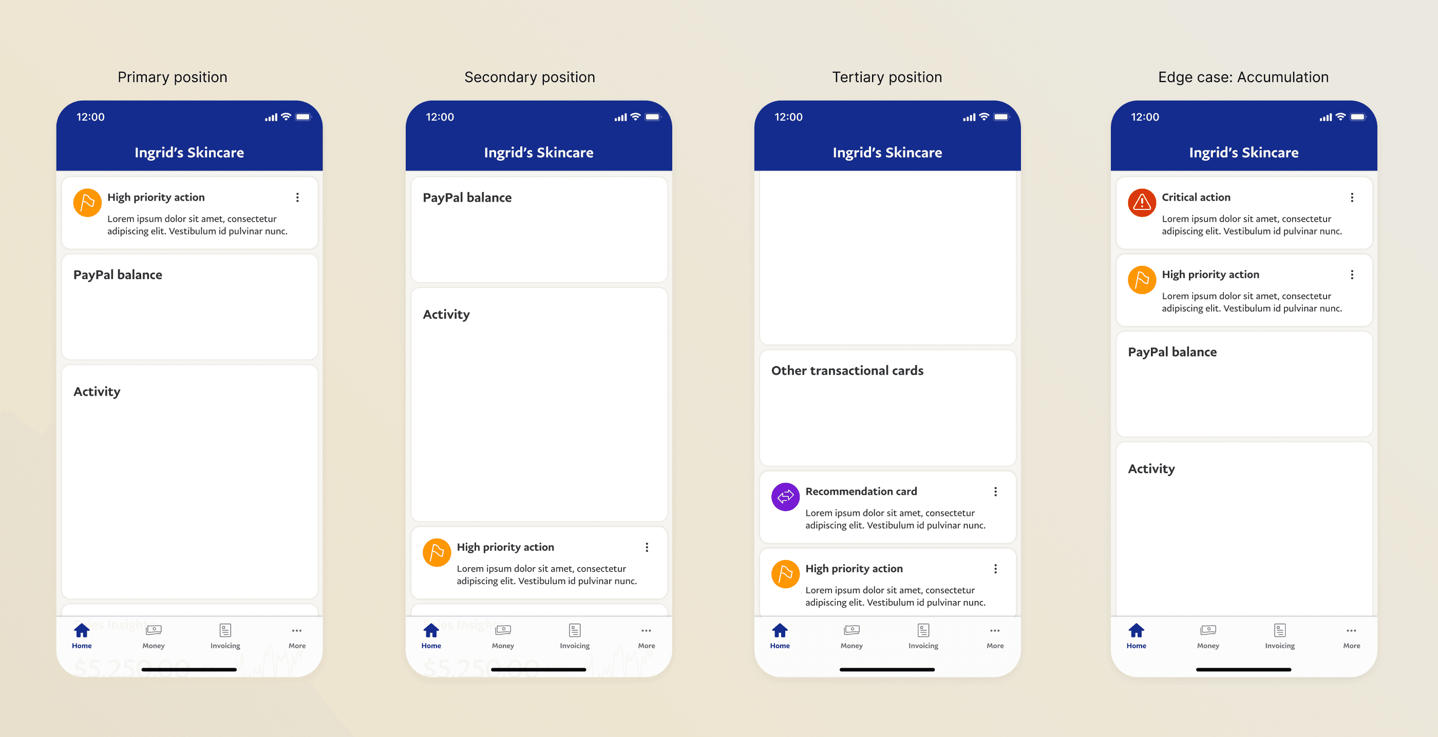
To avoid the “my feature is most important” battle, we set up a ranking system based on click-through rate (CTR). Customer disputes topped the chart with 80% CTR. Any team wanting above-the-fold placement had to beat that benchmark — otherwise, their content was de-ranked. Our engineering team built a machine learning system to power these rankings.
Card ranking approach


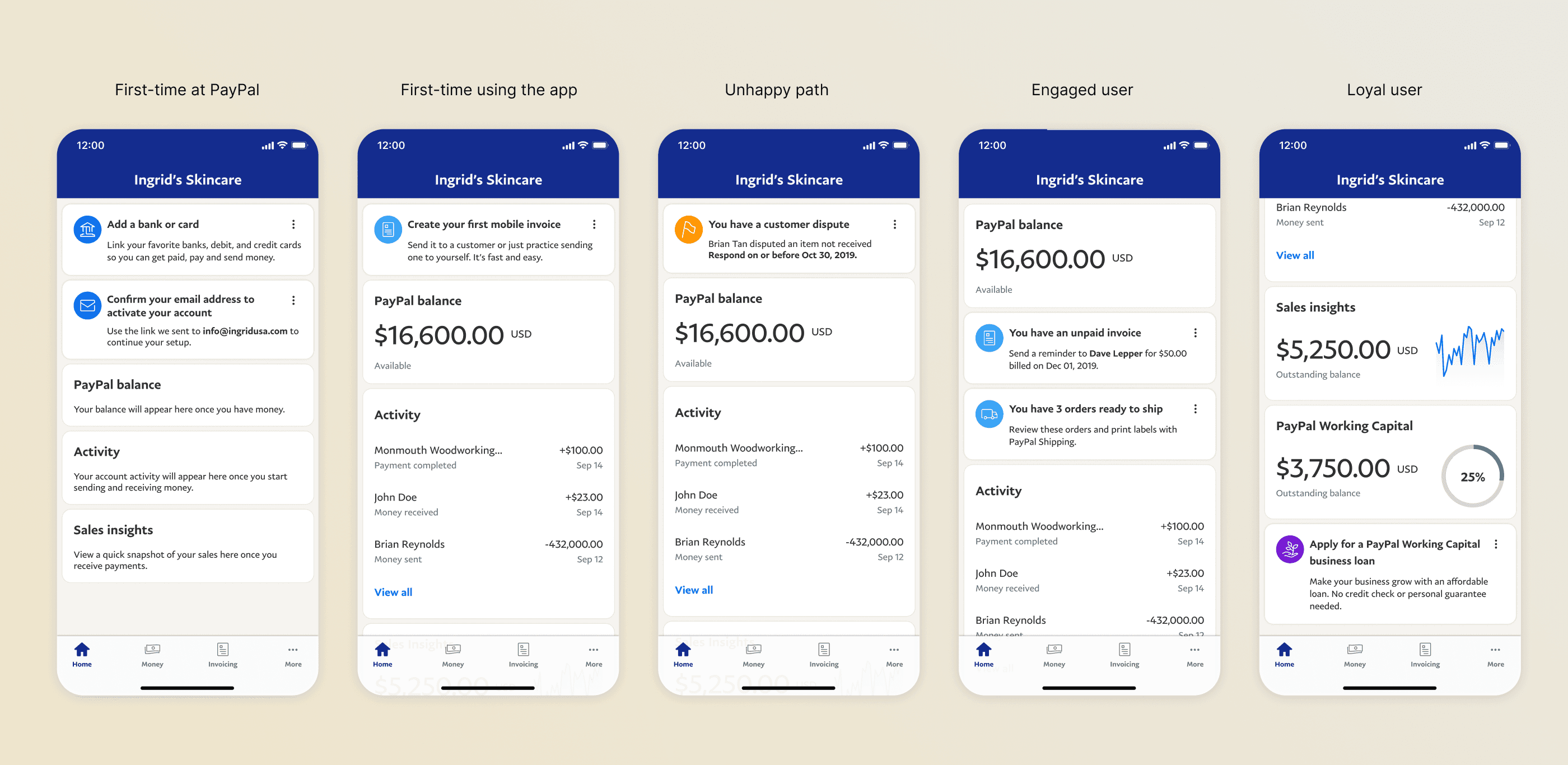
Result: A feed that evolves through the user journey
Over time, we built more than just a home screen — we created a dynamic system where features and messaging worked in sync, guiding merchants through every stage of their journey. Whether they were new to PayPal, handling a dispute, or ready to explore more tools, the feed adapted to meet them where they were. What started as a simple list became a smart, evolving experience — one that supported users from their first invoice to their hundredth sale.
Design directions


Quick actions
The cherry on the cake, and one of our better performing features was "quick actions": An action button that triggered highly used flows to help users get paid, send invoices, respond to messages, and more.
We also refreshed the look and feel of the app using the new design language and iconography launched months later.
