Reimagining PayPal Checkout
Overview
As Staff Product Designer, I led a redesign of PayPal’s checkout architecture to address rising competition and evolving user expectations. We focused on improving transparency and feature discoverability, especially for options like “Pay in 4” and Split payments, while maintaining an 80% conversion rate.
My role
I led a team of 3 designers across the full arc of this project: From research and competing concepts through live beta testing and final delivery. I owned the design strategy, ran stakeholder alignment across product and engineering, and did hands-on design work on the most complex flows: credit products, guest checkout, and error states.
Impact
The redesigned PayPal checkout successfully met key objectives and delivered significant value while improving the user experience, enabling business growth and strengthening PayPal's competitive stance:
Credit adoption increase
Credit adoption increase
Credit applications coming from checkout increased from 2% to 6%
Steadily high conversion
Steadily high conversion
Successfully preserved our critical 80% checkout transaction rate
Improved satisfaction
Customer feedback indicated high satisfaction after the redesign.
Challenge
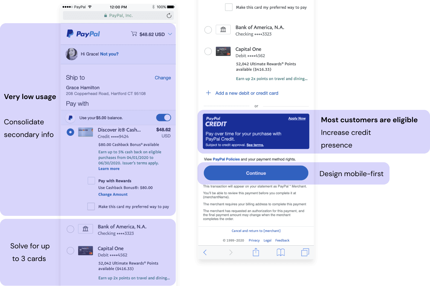
The rise of competitors like Klarna and Afterpay with streamlined credit flows, prompted a critical look at our own checkout experience. With over 30 features, the interface had become dense: Important options like PayPal Credit and flexible payments were buried, impacting discovery and adoption.
Our challenge was to simplify the information architecture, prioritizing key payment methods and integrating all capabilities intuitively, all while preserving behaviors that supported our high conversion rate.
The rise of competitors emphasizing streamlined payment experiences necessitated a critical evaluation of our own checkout flow. Our existing architecture, housing over 30 features, had become dense. A significant portion of the interface was occupied by less critical information, inadvertently obscuring valuable features like PayPal Credit and new flexible payment options. This complexity hindered feature discovery and adoption.
Our challenge was to strategically simplify the information architecture, prioritizing key payment methods and integrating new capabilities intuitively for a broad user base, without disrupting established user behaviors tied to our high conversion rate.
Previous checkout experience
Previous checkout experience
Understanding our customers
Rigorous research, combining user interviews (20 customers with transactions > $140) and behavioral data analysis, provided essential insights to my team:
2 user archetypes with distinct motivations
We identified users primarily driven by security & assurance of correct transactions (Safety-Seekers) and those focused on value maximization and money savings (Optimizers).
Information overload
Data underscored that nearly half the checkout screen was consumed by secondary and tertiary information, overwhelming users and causing them to stick to 1-2 cards to transact and not explore beyond this safety zone.
Principles
Our strategic approach was built on three foundational principles:
Efficiency
Optimizing the flow to minimize cognitive load.
Choice
Presenting payment options clearly and facilitating informed decisions.
Confidence
Instilling user confidence through transparency and reliability.
Exploration and iteration
Collaborative workshops with product and engineering partners allowed us to map the complex feature landscape and develop design concepts aligned with user mental models:
Inline Design: A more conventional, vertical layout emphasizing clarity and familiarity, for safety-seekers.
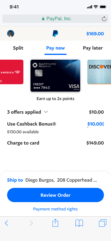
Carousel Design: The carousel pattern widely used across PayPal, solves for choice and satisfies optimizers.
I worked on both designs simultaneously to run stress-tests and iterative usability testing comparing these concepts while balancing stakeholder feedback. We had supporters and detractors for both designs.
Overall, the carousel design demonstrated to be the most exciting for users, but also had a learning curve.
Blueprints
Initial blueprint explorations allowed us to identify how to organize +30 features

Carousel design
Early: Highlight benefits

Mid: Focus on transaction info
Mid:: Focus on transaction info
Mid: Focus on transactions
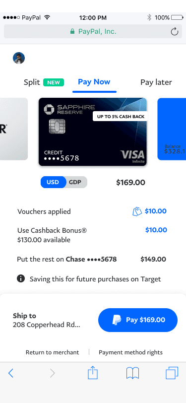
Final concept: Less is more
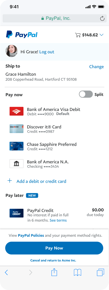
Inline design
Early: Integrate split payments
Mid: Focus on credit products only

Final: Consolidate low usage info

UXR and live testing
I conducted 4 rounds of iterative user testing comparing these concepts. We ruled out concerns regarding reduced content and use of progressive disclosure in both designs, and the use of tabs in the carousel design. Internal excitement for the carousel design, and uncertainty about technical feasibility pointed out to a need for a live prototype and testing.
I helped follow up with a live implementation coordinating batched spec delivery and reviews every week with engineering, and an invitation-only beta testing amongst 100 users in partnership with UXR and marketing teams.
Inline design feedback
Proved to be successful due to familiarity with the old design, while showing only what customers needed to transact.
Carousel user feedback
The carousel had interesting elements and provoked excitement. Customers felt surprised about the drastic UI change.
Strategic pivot
The data was clear: Inline won on conversion confidence, and the carousel introduced too much learning curve risk for a product handling billions in transactions. I made the call to go inline and pull the best interaction patterns from the carousel work: split payment handling and modal sheets for secondary information. The goal was to ship something users trusted while setting up the more ambitious moves for later.
Cross-functional collaboration
The orchestration of multiple use cases was where complexity lived. I personally owned the three highest-stakes flows: Credit product integration, guest checkout, and error handling, because these had the most edge cases and the highest drop-off risk.
The rest of the team handled payment method standardization and SDK compatibility, with me reviewing and maintaining consistency across all surfaces. We shipped in batched spec deliveries every week, with engineering reviews built into the rhythm so nothing got lost in handoff.
This phase required meticulous design work and close partnership to translate strategy into a shippable product.
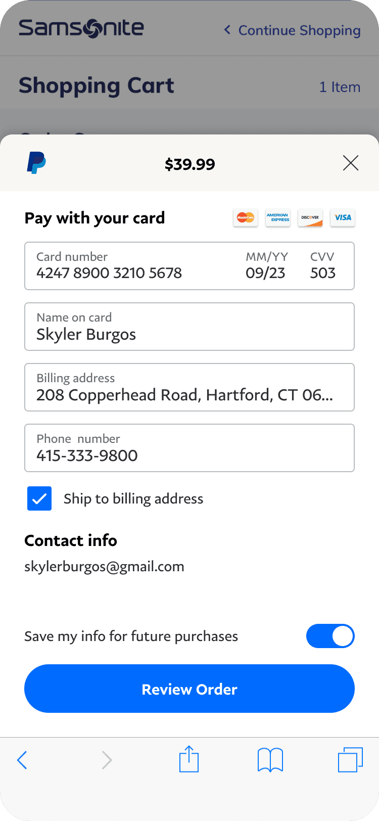
Using a PayPal balance

Foreign cards & conversion rate

Offers applied

Credit application

Credit ready to use

Guest checkout
FURTHER EXPANSION
FURTHER EXPANSION
Split payments
Split payments
The redesign facilitated further product expansions for checkout I also designed, like the ability to split payments between different credit cards for a signle transaction.
Today, customers who report using split payments or credit, have 32% higher average spending than those who pay with a single payment method.
Final thoughts
This project taught me that the hardest part of redesigning something people depend on requires accepting that sometimes the conservative path creates more room to move later. Adopting the inline design wasn't the most exciting choice, but it was the right one. The split payments expansion that followed, and the 32% higher spend it drove, validated that approach.
The compliance engine is now a shared infrastructure, used across Gusto to power HR, payroll, and benefits compliance alerts and changes.It inspired adoption of compliance UX principles company-wide, and brought a constant stream of revenue to multiple Gusto products and partners (HR trainings, law posters, benefits and insurance providers).
Further empathy studies showed that employers expressed awareness of how Gusto helps with compliance, also reflected in reduced customer support related calls.