
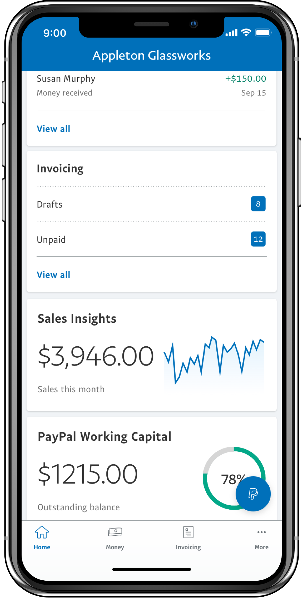
PayPal for Business helps merchants manage their business on the go with features like Invoicing, money management and customer lists.
I designed "Sales Insights", an interactive section of the app that provides sales trends information to merchants, helping them make better decisions critical to their business operation and finances.
Users can move through tabs to visualize sales in different timeframes.
Within pages, the graphs can be explored by swiping sideways to move across time.
By tapping on the "compare" button, merchants can appreciate how sales in the present period compare with a year before, and reflect on the past.
In our annual UX study "Merchant on the Go" where we analyzed the use of smartphones in small business owners, the following insights pointed out towards the inclusion of a different Sales Insights in the PayPal Business App:
Vision: Help small business owners visualize their sales so they can reflect on the past, and make decisions for the future.
To support our opportunity statement I continued the solution discovery journey started by another designer. My first step was to align the design with our design systems, and improve the way sales were presented in different periods of time.
Every week I took my design iterations to test with 6 users, in a total of 16 iterative sessions. Some interesting discoveries that helped me evolve the design were:


I brainstormed several use cases, where data would be visualized in different ways. For example: What would the user see when comparing an incomplete year, Vs. the previous year?


Very often prototyping tools were not enough to show my product and engineering partners how a graph should behave in every single case. In such case I sat down with the engineers so they could demo their progress and then I could provide live feedback on their changes.
This example shows one of those demo and tweak sessions.
Sales can be viewed in different tabs corresponding to time periods. Users can scroll through time sideways and tap on plot points to view information specific to a time unit.


As I started focusing on dark and white theming for the app, and to comply with accessibility guidelines I proposed a revisit to the color palette in 2019. The new color palette brings clarity and look and feel more in line with PayPal standards.

Better retention
After launching insights the app went from a 4-week retention average of 31% to 42%.
Longer sessions
Users who visit sales insights spend around 1 minute more than non-visitors exploring data.
Great user feedback
Insights became one of the most praised features, for which the app receives most of its 5-star reviews.