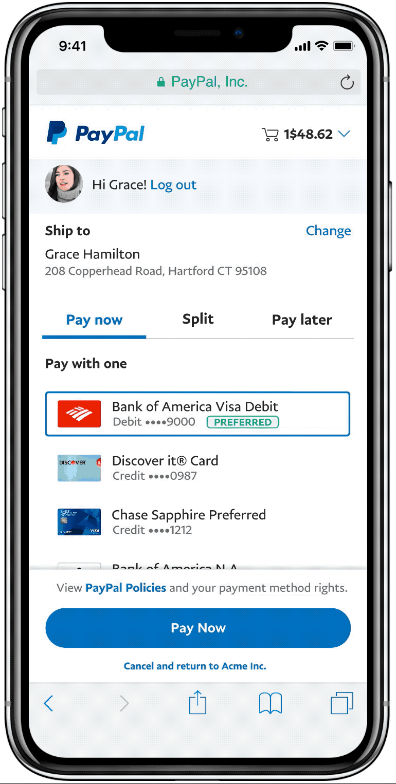
Split tender is a product inside PayPal online checkout, that allows people to pay in online stores splitting a payment between up to three cards or bank accounts in their digital wallet.

In the previous experience users had to activate a sheet to perform a split, and review the result in the main page. From analytics and in-person testing and interviews we found that:

Facilitate the split tender process so people could perform it with high confidence and a low margin of error.
We came up with a hypothesis that by streamlining navigation and the split process, our users would be more likely to stay in the checkout page. Then the design strategy to achieve it would be:
With our goals in mind I coordinated some brainstorm sessions to explore navigation with designers from checkout, credit and design system teams. My goal was to help the user differentiate products, while addressing the business goal of keeping credit prominent. Our group came up with 3 models to do usability testing:

The tabbed and toggled designs were the most successful at keeping users focused while improving comprehension of our three products. Our "Seamless" design made people think that they "had" to pay with multiple cards and we discarded it immediately.
In A/B testing the tabbed version converted at 6% higher than the toggled version.


Once we decided to keep the tabbed and toggle navigation models, I worked on bringing the card selection process to the main checkout page, and let the UI speak for itself when something changed.
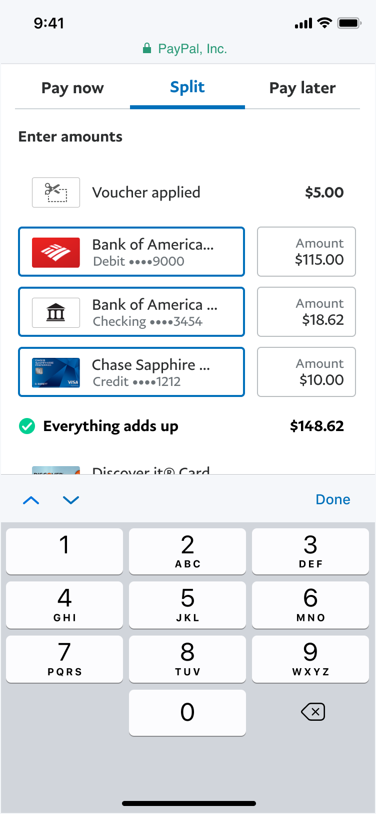
The next iterations focused on creating a selection pattern that worked to choose multiple elements, easily deselect and show which card was being used as a backup for extra charges.
We switched from the old checkbox pattern to boxes, a variation of an existing pattern in our UI library that was stress-tested against all checkout use cases.


In version 1 the product tried to always adjust a field to complete the purchase total, to the discontent of our users. On top of that, some user decisions triggered a set of complicated messages that people didn't understand.

In the new design, the system autocompleted a split the first time a set of fields were used, and when cards were exchanged.
When users wanted to edit, we simply let the system signal when money remained, or when the total was exceeded.
The new design showed with more clarity how cards, banks, vouchers, rewards and the PayPal balance could be combined together to give users more acquisition power.

9% increase in conversion
With the new design users stayed on task and finished.
Higher amount purchases
People spend more: The average purchase amount in split tender users was 15% higher than single card purchases.
Less clicks, more confidence
People can complete a 3-way split in 6 clicks.